Use this tag for test posts.
1 Follower
abc
test
How-tos, questions, and posts about Make No Law
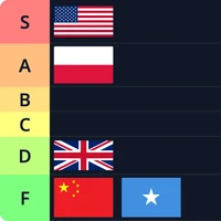
Create tier lists for anything. They can be community poll tiers or view only for others to comment on.
